BLOG
Thoughts, comments, anecdotes, ideas. Updated as they come.
June 7, 2022
Hello again.
For the love of art, artists, and some artworks
Marcel Duchamp, and more specifically, his tombstone
or the following who-knows-how-long, I will publish a daily entry on my blog dedicated to an artist whose work I love. The entries will feature artwork/s, and a brief, few-sentence description about why I love the artist and their work. They will be short and sweet ‘cause this won’t be art criticism or a giving of formal academic accounts. They will be far simpler, and more complex - the entries will be for the love of art, the artists, and some artworks.

Marcel Duchamp’s tombstone in Rouen
When Marcel Duchamp dies of heart failure at the age of 81 in 1968, his final gesture (I suppose I can call it artwork) is marked on his modest tombstone. The tombstone’s inscription reads “D’ailleurs c’est toujours les autres qui meurent”. That translates to "And besides, it's only the others that die" in English.
That’s brilliant for a number of reasons, and I will mention a few.
Reason No. 1
None of us are really there when we die, which is paradoxical to our experience of death whilst alive. We contemplate, fear, walk towards, and experience others’ deaths throughout our lifetimes. Death is a condition for the living - and we sense it daily. Now, imagine dying. The precise moment death takes place is logically unknown to you as the experiencer - it’s only others, the living, that will know you have died.
The French psychoanalyst and philosopher Jacques Lacan spoke of this - as we have no knowledge of our own death, this becomes paradoxical to our existence. We begin living infinitely in an altered state, unaware of our status. It is the awareness we have of pain (physical and emotional) associated with death (which is a condition only the living can be cognizant of) that we fear, not death itself. We simply are not there the moment that occurs, and we carry on.
Hence, “it’s only the others that die”. You, the breathing, is aware of finite death, but only others’ deaths. You will not be aware of yours - which takes me to:
Reason No. 2 for why Duchamp’s tombstone rocks
Since you are not aware of your own death, it logically means that death is impossible and that you become immortal. Lacan’s theory that we carry on infinitely, unaware of our deaths, suggests that immortality. Others have gone, you have not. You have ‘departed’, informally.
Reason No. 3
An informal departure rather than a tragic end gives leeway to the future.
When somebody great dies (your close relative, Stephen Hawking, your beloved dog, Duchamp, whoever) we tend to canonize them and put them on a pedestal. Their lives and their output are mummified and placed behind a thick glass in the museum of our personal and collective histories. They are made-up histories - collections of anecdotes.
Duchamp hated that. It renders life and death static and absolute, rather than fluid and infinite. It is in that infinity that the future opens up for appropriation and development - by postponing life and death they both become illusory, ad infinitum.
In conclusion
Duchamp’s tombstone resonates with his work. The artist rejected conventions, as per usual, by stating (I’m paraphrasing):
My life/death are not sacred
I will live/die forever

Picture of Marcel Duchamp

Fountain, Marcel Duchamp under the pseudonym R. Mutt, 1917
Dec. 4, 2021
Well, HELLO, it’s been a hot minute. Due to personal circumstances I had to take a little break. But here I am, again, to whisper sweet art somethings in your ear.
For the love of art, artists, and some artworks
Lawrence Weiner
For the following who-knows-how-long, I will publish a daily entry on my blog dedicated to an artist whose work I love. The entries will feature artwork/s, and a brief, few-sentence description about why I love the artist and their work. They will be short and sweet ‘cause this won’t be art criticism or a giving of formal academic accounts. They will be far simpler, and more complex - the entries will be for the love of art, the artists, and some artworks.

Some Objects of Desire, Lawrence Weiner, 2004
It feels right to have this entry be about Lawrence Weiner, as he passed away two days ago. He was an incredible artist that created clever and stunning works over his lifetime.
It always hurts bad when a great artist passes. Weiner’s death stabbed like a dagger the way the deaths of Leonard Cohen, Anthony Bourdain, Philip Seymour Hoffman and Norm Macdonald did.
I’ve been on a Norm Macdonald bender recently. It’s like an addiction. Help!
When somebody that gave the world beauty goes, it’s like a glimmer of hope extinguishes when you’re lost somewhere in the ocean, in the middle of the night. Not knowing exactly where you’re headed, but you’re looking for salvation. Weiner offered some of that good salvation with his works, which mostly featured text.
He was one of the important figures in US’s 1960s conceptual art movement. His thing was word art. Now what in the hell is “word art” and how can words pasted on a gallery wall constitute art? Simple Watson.
An object does not have a neutral presence. Most objects, except art (arguably), have a ‘purpose’. A blanket keeps you warm when you lie down. An apple a day keeps the doctor away. You get the idea. When you look at an artwork, and you see a painted object, your brain recognizes that object and slots it in a narrative. If brains could speak, they would sound something like this in such an instance:
“Oh, I see a shape. Let me look in the archive. The archive says that shape is a vase. It also says it’s a vessel that holds flowers. Ok, this makes sense now.”
When your brain determines what it’s looking at, some space frees up for complex thinking concerning the question why - “why am I looking at a vase? Why did the artist paint a vase? Why does it look this way? Why does it hold sunflowers?” Yeah, why Van Gogh, why?
Now, remove the objects from the picture, and signify the idea with words instead. That’s what Weiner did - use the neutrality of language as an objective means to explore our relationship to the world.

Crushed Between Cobblestones, Lawrence Weiner, 1988
Simple tenet of linguistics - words as material can build our perception of reality around us. A lot like representational visual art, except swap representation with a word. How can words build our perception? For example - the Pirahã peoples’ language lacks numbers. 0 numbers. When asked how old they are, they can’t answer. When given 10 items and asked, how many are there, they say “many”. When given 2 items, they say “few”. How about what year is it? That’s all irrelevant. When the language doesn’t accommodate quantification, quantification simply doesn’t exist. On the contrary, in our culture, quantification is tremendously, deeply, important. Much like words can define reality, so can art, according to Weiner.

CHAINS WRAPPED AROUND ONE THING & ANOTHER BROKEN ONE BY ONE WITH THE PASSAGE OF TIME (RUSTED FREE) (BUSTED OPEN) (PULLED APART) (MELTED LOOSE) (---------) (---------), Lawrence Weiner, 1990
Apart from being brilliant, Weiner’s artwork is also beautiful. Read the words above - chains wrapped around one thing & another broken one by one with the passage of time…
It’s poetic. If art has the capacity to change people’s perception of their world, as Weiner states, then his words definitely do that with a punch square in the belly.

Made to Be, Lawrence Weiner, 2016
Nov. 6, 2021
For the love of art, artists, and some artworks
Cy Twombly
For the following who-knows-how-long, I will publish a daily entry on my blog dedicated to an artist whose work I love. The entries will feature artwork/s, and a brief, few-sentence description about why I love the artist and their work. They will be short and sweet ‘cause this won’t be art criticism or a giving of formal academic accounts. They will be far simpler, and more complex - the entries will be for the love of art, the artists, and some artworks.

Untitled from the Bacchus series, Cy Twombly, 2003-2005

Installation view of Cy Twombly’s Bacchus series at the Tate Modern
The first time I saw Twombly’s works, I wasn’t sure what I was looking at. I knew that I liked them, however. The marks he left resemble scratches, or child-like doodles created with a sense of tremendous abandon. Madness, and ecstasy. I can almost picture him making his art, in a trance-like state, in a manner that rejects the premeditated, the perfected, and the thought-through. His paintings give a sense of expulsion that’s akin to a religious moment - a purging.
Imagine standing in the middle of your living room. At your feet, there is a great blank surface. You have a marker. Somebody tells you that you can let go and start marking it up as you please - the only caveat is that you need to ditch your ego and relinquish control to your id. What may come out from this event is a surface that captures a primordial moment of being a human animal, which is a moment we’re all familiar with, and a moment that passes in a flash.

Venus, Cy Twombly, 1975
Twombly seems to access something unscathed and fundamental in human consciousness and behaviour, akin to the proponents of automatism (a style of writing or making art without a conscious thought). Through palpable bodily movements, Twombly creates fields that are both explosive with energy, and repetitive. Repetition is the element that allows for the abandon of logic and consciousness, and in turn, for the initiation of a “religious” event.
Looking at his artworks reminds me of watching Sufi dervishes. Here’s a video of Sufi dervishes in action that is guaranteed to get you high.

Untitled (New York City), Cy Twombly, 1968
The junction between the primordial and the sacred which Twombly’s works strike is exactly why I love his painting. The human animal and the priest in a state of trance, combined into a singular moment, and documented on a surface.
Cy Twombly also produced a great deal of photography, which feels entirely different than his paintings. Here’s a teaser, showing two of his photographs - I will write about them separately, in the next post.

Untitled, Cy Twombly, 2002

Strawberries (Gaeta), Cy Twombly, 2008
Oct. 23, 2021
For the love of art, artists, and some artworks
Otto Dix: where beauty (finally) gave way to the ugly underbelly of society
For the following who-knows-how-long, I will publish a daily entry on my blog dedicated to an artist whose work I love. The entries will feature artwork/s, and a brief, few-sentence description about why I love the artist and their work. They will be short and sweet ‘cause this won’t be art criticism or a giving of formal academic accounts. They will be far simpler, and more complex - the entries will be for the love of art, the artists, and some artworks.

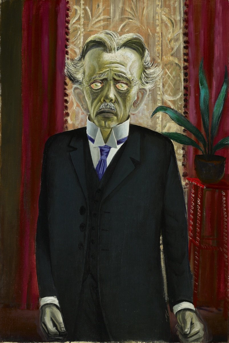
Portrait of Journalist Sylvia von Harden, Otto Dix, 1926
The painting above is one of the best portraits I’ve seen. When the German artist, Otto Dix, approached journalist Sylvia von Harden asking if he could paint her, their conversation went more or less like this:
Otto: I must paint you! I simply must!... You are representative of an entire epoch!
Sylvia: So, you want to paint my lacklustre eyes, my ornate ears, my long nose, my thin lips; you want to paint my long hands, my short legs, my big feet—things which can only scare people off and delight no-one?
Otto: You have brilliantly characterized yourself, and all that will lead to a portrait representative of an epoch concerned not with the outward beauty of a woman but rather with her psychological condition. (New Objectivity)
Emancipated from the necessity to be represented as ‘a beautiful woman’, which women have been by the hands of male artists, Sylvia von Harden appears as the badass journalist she was. Dix didn’t depict her as a subject/object of male desire, in fact, her androgynous appearance, sallow skin and slightly terrifying mouth are far from the undulating, bulbous and erotic feminine in MANY representations of the female form.
Von Harden’s cropped hair, her cigarette, her cocktail, her stocking nonchalantly slipping off her calf (to hell with perfection, modesty and nauseating prudence), and her hands - pay attention to these fantastic ET fingers and large hands - free von Harden from objectification. The focus turns to her as a character representative of an epoch in Weimar Germany; to her as a public intellectual.
The reason for why I love the big hands is because of hands’ binary symbolism of the masculine or the feminine. Big, strong hands = masculine, labor, intellectualism. Dainty, soft hands = feminine, motherly, comforting. Von Harden ain’t about the latter, or the status quo.
Let’s face it though, Dix’s depiction of von Harden borders ugly. He wasn’t in the business of highlighting beauty - the opposite in fact.
Portrait of Dr. Heinrich Stadelmann, Otto Dix, 1922
Dix wanted to represent people, their character, and their psychological condition truthfully. Here comes a question regarding realism vs. abstraction in art.
Look at Dr. Heinrich Stadelmann above. If you saw a man looking like this, you would likely pinch yourself to wake up from your nightmare. He can’t physically exist. However, his state of mind, which is what Dix chooses to express (compromising all things that make a human look human) definitely exists. Anxiety. Nausea. Fear. Psychological decay caused by trauma. The trauma Dix spoke of in this artworks concerned post-World War 1 Germany. The great, corrupt, horrific Weimar Republic, which paved the way to Nazi Germany and World War 2.
A number of artists in Germany criticized that era and pointed to it as a time of political, societal, moral and existential decay. All that was beautiful in humanity was tossed out the window, and what was left were horror, murder, the corruption of the soul, the depraved, the vile. A time of hopelessness, of bleakness.

Lustmord, from Tod und AuferstehungI, Otto Dix, 1922
The etching above is despicable and horrific. It shows a disemboweled, emaciated prostitute. The right-hand corner shows two dogs fucking. I choose that word carefully here - fucking. Look at the passive, dumb face of the white poodle that’s taking it from the black dog. The black dog looks more like a menacing silhouette than a subject. The poodle’s expression is completely absurd in light of the main subject matter - the murdered woman, sprawled skeletal and featureless on a blood-stained bed. A bottle rolling on the ground in line with her hanging lifeless arm. She is naked - except her shoes and stockings. The image is so incredibly vulgar and awful.
And that’s why I like it. I like it because Dix captures the most depraved, awful corners of one’s mind. He was interested in lustmord - images of sexual violence.
Looking at the etching above and writing about it isn’t easy, but it’s important to bring light to an image created one-hundred years ago that aimed to reflect on the social, political, and individualistic realities of Weimar Germany, of war, and most importantly - of what a human being is capable of doing to another. Violence, war, brutality - they’re all dark parts of human nature.
I highly encourage you to look at more artworks by Otto Dix, and to read more about his practice. It feels relevant, albeit specific and extreme.
I wonder what our personal/society’s degradation in 2021 would look like painted.
Oct. 19, 2021
I am not posting every day. Life gets in the way. That’s okay, the randomized pattern works well with the concept of this project.
For the love of art, artists, and some artworks
Théodore Géricault
For the following who-knows-how-long, I will publish a daily entry on my blog dedicated to an artist whose work I love. The entries will feature artwork/s, and a brief, few-sentence description about why I love the artist and their work. They will be short and sweet ‘cause this won’t be art criticism or a giving of formal academic accounts. They will be far simpler, and more complex - the entries will be for the love of art, the artists, and some artworks.

Severed Heads, Theodore Gericault, 1818
Most famous for this epic painting, The Raft of the Medusa (depicted below), Gericault was a complex, macabre, and revolutionary artist. At a time when preferred art depicted legendary battle scenes, dramatic biblical narratives, heroic Classical ideals, and an erotic Aphrodite here and there, Gericault opted to paint death and decay. And I’m really into these two themes.

The Raft of the Medusa, Theodore Gericault, 1818-1819
Before we dive into Gericault’s works that really get me going, I must say a thing or two about The Raft of the Medusa. If you click on the image, it will take you directly to its Wikipedia page, so you can read about it as much as your heart desires. P.S. Gericault painted it when he was 27 YEARS OLD. Long story short - the giant painting shows the remnants of a shipwreck that left naval officers on a raft, waiting for rescue from the French navy. They were adrift for days on end, and hungry, dehydrated and terrified, they resorted to cannibalism. True story. The shipwreck became a national scandal. Gericault painted the dramatic scene to depict two things - the reality of decay (physical and moral) of people at the brink of death, and to condemn the French government for sending its men in inhospitable seas + their sluggish rescue mission. The painting caused a scandal.
You know that when an artwork causes scandal, it’s probably doing something right - probing the status quo. That still holds true in contemporary art practices. I am not necessarily looking to be shocked, but I am definitely not looking to be bored.
As to Gericault circa the early 19th century, ain’t nobody looking for pictures of dead people being eaten by emaciated and desperate people waiting for salvation. The idea itself is horrifying, let alone its depiction. However, it conveys an uncomfortable truth about human nature. Death here becomes the great equalizer. As they say, at the end of the game, all the chess pieces go in the same box, kings and pawns alike.
In terms of visual art, Gericault’s portrayal of death and decay, using the tools of grand Renaissance art, was a great equalizer. The artist smacked audiences right in the face when he elevated some uncomfortable truths to the status of glamorous, noble art. But art was meant to be beautiful! Epic. It was meant to convey virtue, fantasy, it was meant to scintillate the senses. Something in art’s conceived function broke with Gericault, and that’s why I find him revolutionary.

Study of Feet and Hands, Theodore Gericault, 1818-1819
He painted a ton of severed body parts. Again, at a time where still-life depicted generally dull and beautiful things like ripe fruit, Gericault had a thing for getting people to bring severed heads, arms and legs to his studio. Nothing psychopathic happened there, these body parts belonged to people who didn’t die in the name of art. He observed them and painted them realistically, once more shedding light on an uncomfortable and ugly truth about being human - we will die. And our bodies will decompose. When that happens, we will be anonymous, redundant flesh.
That kind of narrative was very uncouth for the 19th century Western, Christian audience. Your flesh is the flesh of God, the flesh of Jesus who died for your sins. It’s sacred. Not for Gericault it wasn’t.
The artist also painted the portraits of mentally disabled people. If they live on the fringes of society today, imagine how it was two-hundred years ago. They were regarded as cursed by God and were not looked at, nor talked about. They were locked away as pariah to society.

Insane Woman, Theodore Gericault, 1822
I am not sure Gericault’s aim was to fight for social justice by painting the disabled. Keep in mind he made this artwork two-hundred years ago. However, he broke the status quo by showing subject matter that was considered unacceptable. In addition, he was interested in portraying how pain and suffering looked realistically - he studied and painted prison inmates, the heads of guillotine victims (as shown in the first image of this post), and people in compromised (agonizing) mental states.
He died of illness young, at the age of 32, after suffering a great deal. He painted his self-portrait, as a dying man.
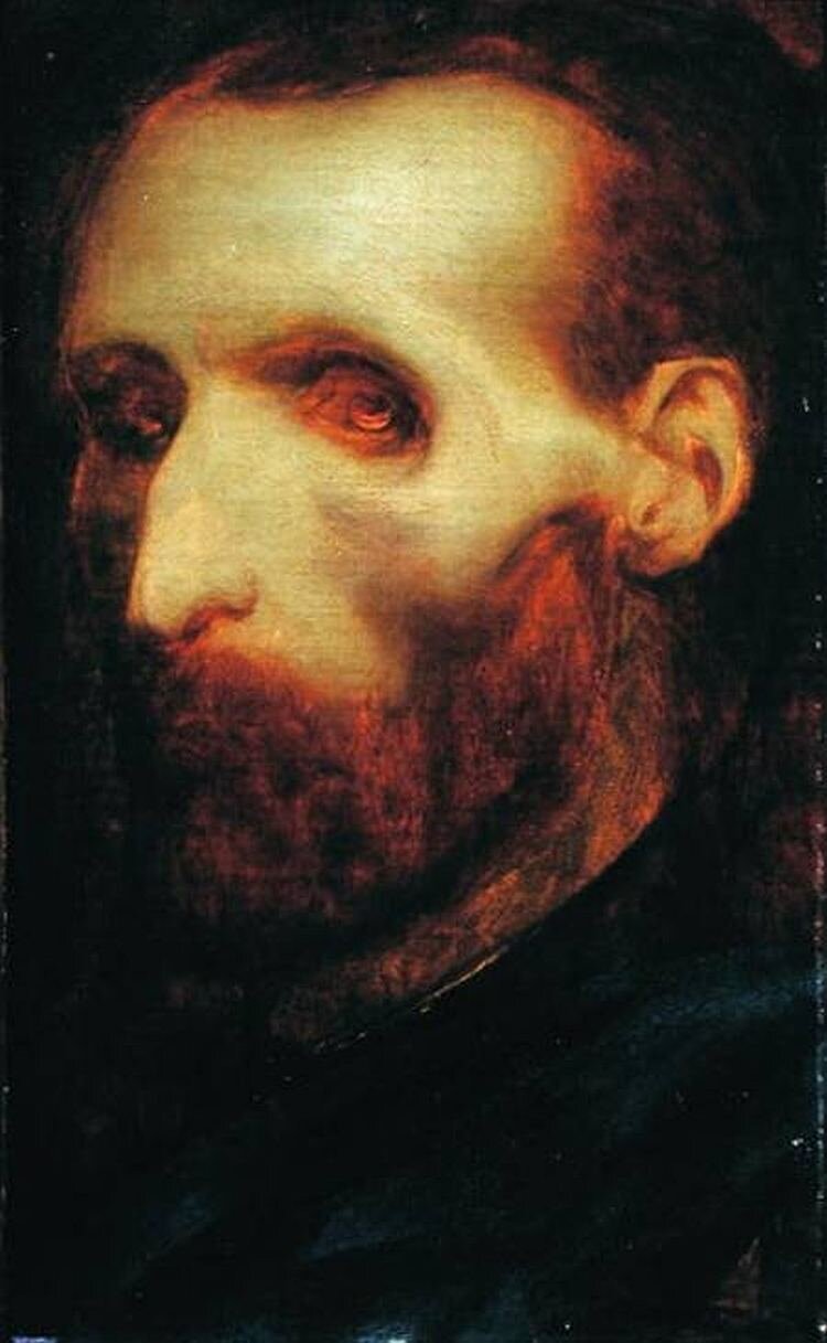
Self-Portrait as a Dying Man, Theodore Gericault, 1824
Oct. 13, 2021
For the love of art, artists, and some artworks
Annette Messager
For the following who-knows-how-long, I will publish a daily entry on my blog dedicated to an artist whose work I love. The entries will feature artwork/s, and a brief, few-sentence description about why I love the artist and their work. They will be short and sweet ‘cause this won’t be art criticism or a giving of formal academic accounts. They will be far simpler, and more complex - the entries will be for the love of art, the artists, and some artworks.

Installation from the exhibit La Messaggera di Villa Medici, Annette Messager, 2017

Mes Veux, Annette Messager, 1989
Above are two of the many artworks that I love by the contemporary French artist, Annette Messager. I like a lot of her stuff - picking favourites is difficult. The same goes for every artist I discuss here. It’s like picking your favourite dish or colour. There’s just so much goodness out there. Agnes Martin (who will be a part of this project in the near future) said:
The measure of your life is the amount of beauty and happiness of which you are aware
I think she’s right about that. Back to Annette Messager.
I hate to say I became aware of her because of her late husband, Christian Boltanski (RIP, he passed away three months ago). Another behemoth of epic proportions in the contemporary art world, whose work I love dearly. It feels their styles work with one another, and artistically, they make sense as a couple - they both play with notions of memory, trauma, identity. The figures they create are often whimsical which are at once eerie, ghostly, they echo childhood, and a sense of mummified innocence. When I write on Boltanski, I will compare and contrast. Unlike Boltanski, Messager’s artwork taps into something far more personal and intimate. Individualistic. There’s something phantasmagorical in it. It’s like peeking into the most private folds of somebody’s mind, where fantasies, desires and the understanding of oneself are fragmented and built into a hybrid network of frames and wires.

Mes voeux sous filets, Annette Messager, 1997
This installation exemplifies my sentiment. Composed of seven photographs and connected by string, the title says it all “My wishes under nets”. I used Google Translate, pardon if the translation is a bit wonky.
There is something in that work that taps into that secret garden that we all carry inside us - her installation points to the fact that the secret, confidential self, very much exists. That self is intricate, complex, interconnected, strange, tight yet loose, opaque and fragile. The images that flash in our minds that represent our desires are crisp, yet they blur due to the body that holds them together. We all participate in, and share, that condition. Which is why we can relate to Messager’s work, and by virtue of it highlighting a common experience, to one another. As I mentioned in an earlier post, to me, the measure of good art is one that conveys universal conditions of all/any nature.
Moreover, I simply love how her works look aesthetically. They show how the personal and internal can appear nightmarish. Violent and aggressive. The thing about desire and fantasy is…the thing about desire and fantasy is that they can consume everything in their way. Including innocence, morals, and all sorts of learned proper conduct.
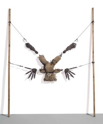
Counter-Pike (with Victim), Annette Messager, c. 2002-2003
The thing about desires and fantasies is that they don’t belong to children only. We have those until we breathe our last, and the child inside us is very much NOT dead, which is something I think about when I look at the artwork above. Yes, it’s disturbing, but also it shows the sort of violence our inner worlds inflict on us - perhaps the mourning of a loss of innocence, a grotesque display of our relationship to innocence in adulthood.
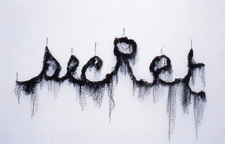
Secret, Annette Messager, 2006
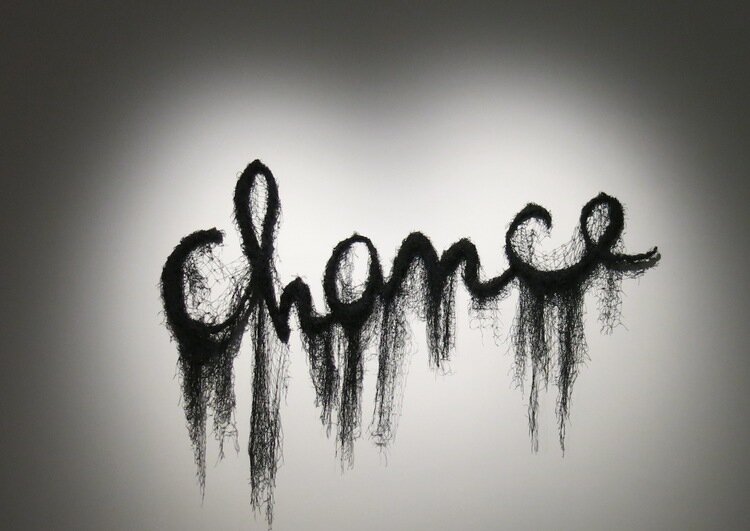
Chance, Annette Messager, 2011-2012
Oct. 9, 2021
For the love of art, artists, and some artworks
Mike Disfarmer
For the following who-knows-how-long, I will publish a daily entry on my blog dedicated to an artist whose work I love. The entries will feature artwork/s, and a brief, few-sentence description about why I love the artist and their work. They will be short and sweet ‘cause this won’t be art criticism or a giving of formal academic accounts. They will be far simpler, and more complex - the entries will be for the love of art, the artists, and some artworks.

Wanda and Mary (Thomas) Carltons, Mike Disfarmer, c. 1940
I first discovered Mike Disfarmer’s photographs shortly after the documentary Disfarmer: A Portrait of America came out. I watched it on TV, which was a coincidence, because I was only looking for a program that would emit white noise as I puttered about the house. When I saw the faces Disfarmer captured in his works, I was instantly transfixed on the couch. His images haven’t left my mind for about decade since.
I recalled the documentary covered his life. Very little is known about him. He was originally born in Indiana, and moved to rural Arkansas, in the town of Heber Springs, in the late 1890s. He apparently kept to himself, and locals considered him eccentric. From what I recall, he didn’t have a family, or much of a social life, in a town where everyone knew one another.
Disfarmer set up a small photography studio in his home, and asked the local townspeople to come and have their portrait taken. Just for the love of photography - I don’t recall his objective being business-inspired.

Untitled, Mike Disfarmer, c. 1940
The locals were suspicious - not only was that Mike guy pretty weird, but he also had a camera. And it captured images. It would capture their very likeness. No one in Heber Springs had seen a camera before. Perhaps there was something satanic about it? No one took on Disfarmer’s offer to sit and have their portrait taken. The artist’s solution was to place a sign outside his studio that read (I’m paraphrasing ‘cause I forget the details) I’ll pay 1 cent to every person who sits for a photo.
Bit by bit, people started coming in. 1 cent at the time was decent money, and life after the Great Depression was rough. They sat for a good amount of time before Disfamer’s camera - making a single photograph back then took a while. Which is why the expressions on the subjects’ faces are so strange. These people sat there and waited, and waited. And waited. Then the image would be captured. Smiling in photography wasn’t a thing back then, seeing as how that would probably be their one and only photographed portrait ever. There wasn’t yet a culture of mass photography, thus a space for performativity, expression, mundanity, fuck-ups. Fast forward 80 years later.

Herby, Lee and Clarence Rackley, Brothers, Mike Disfarmer, c. 1940
The townspeople started to trust Disfarmer, and began to come in on their own volition to have their picture taken. The volunteers started to dress up in their best outfits for their portrait, or the outfits they wanted to present their identity through - as seen above, one of the Rackley brothers was a sailor and wanted that to be known.
Disfamer amassed a huge archive of images of the Heber Springs residents. Their unaffected expressions, their honest presences, and the bare-bones and crisp subject matter in Disfarmer’s photographs present a true portrait of a moment in time and an entire community as one body. Not just individuals. Apart from the overarching portrait built from hundreds of singular ones, I love how the artist has captured each face - unglorified, sincere, direct. An element of how portraiture ought to be.

George and Harold Choate, Mike Disfarmer, 1943

Untitled, Mike Disfarmer, c. 1940
Here’s a link to the documentary Disfarmer: A Portrait of America. Watch it when you got the chance.
Oct. 7, 2021
For the love of art, artists, and some artworks
Teresa Margolles
For the following who-knows-how-long, I will publish a daily entry on my blog dedicated to an artist whose work I love. The entries will feature artwork/s, and a brief, few-sentence description about why I love the artist and their work. They will be short and sweet ‘cause this won’t be art criticism or a giving of formal academic accounts. They will be far simpler, and more complex - the entries will be for the love of art, the artists, and some artworks.

Plancha (Hotplate), Teresa Margolles, 2014
Morbid. Strong. Multi-sensory. Violent. A dagger straight in the gut. Those are some of the words I’d use to describe Teresa Margolles’s artworks. They address the intersection of two main subjects - death and socio-economic/political unrest that’s the cause of violent death in her native Mexico.
You need to have the background story supporting her artwork to fully grasp just how powerful it is.
Originally trained as a forensic pathologist, Margolles works with morgues in Mexico and Latin America to create her installations. She collects items from the morgues such as rags used to mop up blood from crime scenes, or cloth used to wash the recently deceased. With those items, she creates large-scale installations that can be visual, audible, and olfactory. She literally forces the audience to interact with the bodies of the dead, a few degrees removed.
The artwork above, Plancha (Hotplate), is composed of 10 hotplates onto which a drop of water drips from above every ten seconds or so. The room where the artwork is placed is dark. Your senses grasp the glowing hotplates, the loud sizzle of the drops as they quickly evaporate once they hit a hotplate, and an indistinguishable scent. The drops are composed of a mix of water extracted from fabric that was used to clean the site where a body of a person murdered at the Mexican/US border was found. What you smell is precisely that - remnants of an anonymous victim of assault. Their body permeates yours as you breathe in. The sound made from the evaporation is quick and violent, occurring for a split-second. Akin to how quick a human life can extinguish from a single gesture of violence.
Remaining impartial to the socio-political unrest she addresses is impossible in these circumstances. It’s impossible to passively consider death when the body of the deceased enters yours. Your breathing - your response to being alive - is inextricably linked to somebody else’s death.
I find her way of addressing death and violence remarkable. As I mentioned earlier, it’s like a dagger in the gut. Death gains a form, a taste, and texture, when you’re confronted with a body. Death in Margolles’s artwork is not mitigated and theorized by words found in a newspaper article, a poem, or a visual representation examining death and associations we make with violence and memory. When interacting with her work, we can’t simply turn a page and think “well that sucks”. Could you indifferently say “well that sucks” if you stood in front of a dead body?

Lemas (Mottos), Teresa Margolles, 2009
The image above shows fabric that Margolles has used for an installation. The fabric has been soaked in blood gathered from locations where murders have taken place. The victims of crime have been disproportionately impoverished, and have lived with violence and socio-economic instability.
Confronting this work, you confront a corpse. A morbid portrait of anonymous victims. Margolles takes “all that’s left” - the non-glorified fragments of a life.
Oct. 6, 2021
For the love of art, artists, and some artworks
Jacob Lawrence
For the following who-knows-how-long, I will publish a daily entry on my blog dedicated to an artist whose work I love. The entries will feature artwork/s, and a brief, few-sentence description about why I love the artist and their work. They will be short and sweet ‘cause this won’t be art criticism or a giving of formal academic accounts. They will be far simpler, and more complex - the entries will be for the love of art, the artists, and some artworks.

Tombstones, Jacob Lawrence, 1942
Jacob Lawrence painted everyday scenes in Harlem, New York. Black communities lived on the margins, as they do today. Lawrence’s works are like stamps in time that show how life looked like for black communities approximately one century ago.
What I love about his work is how he layers a ton of details within a canvas that captures an entire universe in a precise moment - almost like photography does. It’s odd that Lawrence’s work reminds me of photography’s ability to wholly depict a scene, because his figures are stylized and Cubist. Actually, it’s not odd, pay attention to the details in Tombstones. There are so many things happening in that painting. The woman holding her child on the right, the red carriage with a baby that’s dropped its toy, reaching for it. The men going up the staircase, the woman standing behind the left window.
The figure that drives me wild is the woman in the yellow dress sitting on the staircase. In Lawrence’s scene full of movement showing a snippet in time, she sits static, like the tombstones on sale below. It feels like for them time is still, and encapsulated in an otherwise explosive world. And for the viewer, the woman in the yellow dress and the tombstones provide a moment of silence.
Another thing I love about his works is that you can almost taste, smell and hear the noises in the scenes he represents. They’re not cinematic, they’re tactile. I haven’t lived in Harlem in the 40s, but I feel like I can hear the noise on its streets.

Harlem Street Scene, Jacob Lawrence, 1942
Again, here there are countless of mini-worlds captured within the two-dimensional plane of one canvas. I am teleported there, a participant on the street, where everyone is anonymous, where I am anonymous too. I love the shop signs, Bar and Grill, Meats. To anyone that’s lived in North America, these kinds of shops are so ubiquitous and felt. Even if you haven’t lived in North America, we’ve all seen Hollywood movies - these sorts of institutions are collectively and aesthetically understood.
Once again, you can spend a good amount of time just looking at the details in Harlem Street Scene. Time here is flattened and everything happens all at once. A result achieved through painting.

The Lovers, Jacob Lawrence, 1946
Here we have something more intimate. We’re peeking through one of the countless windows Lawrence depicts in his street scenes. The inclusion of a thousand small details is still here, however. The portraits of family members on the left, his hat resting on the couch. These elements show stillness, like the lady in the yellow dress in Tombstones. Dynamism is included by the lit cigarette, the record player, the way the lovers’ bodies are positioned - all these are in motion, in transit, bound to an act in time.
Overall, I love Lawrence’s paintings because they’re intimate, they’re human, they’re tender. Despite depicting a specific moment in history, in a specific location, and a specific context, his works feel universal. The details bring a dimension of life that jolt all our senses - almost as if we are there as participants. Participants in a memory that isn’t necessarily real to us. There is something sublime about having memories that aren’t yours and feeling their impact in your bones - that’s called proper universality.
Oct. 5, 2021
For the love of art, artists, and some artworks
Jackson Pollock
After a half-year hiatus, on a sunny afternoon, an idea hit me like a brick. For the following who-knows-how-long, I will publish a daily entry on my blog dedicated to an artist whose work I love. The entries will feature artwork/s, and a brief, few-sentence description about why I love the artist and their work. They will be short and sweet ‘cause this won’t be art criticism or a giving of formal academic accounts. They will be far simpler, and more complex - the entries will be for the love of art, the artists, and some artworks.
The entries will be posted in no particular order. Historiography won’t account to what gets posted when, nor will geography, nor any overarching themes. The curation will be a free fall into whoever floats my boat on that day. Some days you wake up feeling Caravaggio, other days you wake up feeling Murakami. You know that feeling?
…
A little more on the project…
I was standing by the window looking out to the street and running a mental list of artists who I love, and artworks which I love. The figures never change, and keep accumulating with time. I have loved Jackson Pollock since I first saw his paintings at fourteen, and Michelangelo since I first saw his Pieta at seven. I love Betty Tompkins, who I just discovered some months ago.
The large list of artists smacking my memory felt endless, so I started writing their names down. The artworks that came to mind span across time, cultures, histories, meanings, contexts. They cropped up in no order, in some form of archival chaos. Then it came to me - I share my passion for these artists with friends and colleagues on the regular. They slide through casual conversation. It’s time to tighten up that archive and give it form.
Disclaimer, ‘cause there are always disclaimers. Looking at my incomplete list, it sucks that a lot of the artists are white dudes. It’s not something that I haven’t thought of or considered - but I won’t be changing my list. It contains artists who I love, among which are women and artists from marginalized communities. Unfortunately, art institutions were/are white dude territory. My first university lecture on art in 2006 featured 20th century French guys exclusively. I hope that changes. Having said that, some of the French guys are still good. Here we go.

Autumn Rhythm (Number 30), Jackson Pollock, 1950
First saw his work at fourteen. My brother and I sat in front of our clunky desktop computer, and typed his name in the search engine. About five minutes later, when the pixelated images began to pop up, I fell in love.
Pollock’s gestures of abandon were something I’d never seen before. To relinquish control appeared impossible, and irresponsible. What the method of action painting produced was madness and beauty. I asked myself, how can you lay a megalithic canvas on the floor and walk around it, use your entire body, throw paint, and create something so visually complete? A lot of his works carry the word rhythm in their title. The trance-like state in which Pollock painted was rhythmic, and ritualistic. There is no complete letting-go in that. Rather, a balanced dance between chance and control. I felt that the process of art-making Pollock employed summarized life metaphysically.
It seems that he began his paintings unaware of where they’d lead him or how they’d look. Frankly, that didn’t, and often doesn’t matter. He made enough decisions that guided him through the process. There is absolute order in his chaos, which is felt in the harmony of all his gestures that appear like madness. I love Jackson Pollock for letting go enough to allow something transcendent to come through — a body unhinged by theory and rigid intent.
Watch a pretty good documentary on him here - it features footage of him at work.

No. 26A: Black and White, Jackson Pollock, 1948
March 11, 2021
The gods must be crazy, and I want to give them back their NFTs
Have you guys seen The Gods Must Be Crazy? It’s not a bad movie – apart from being racially patronizing and ignorant to South Africa’s apartheid. The main character, Xi, is a Bushman from the Kalahari Desert. He, and his people from the San tribe, live seemingly blissful lives away from the industrialized world – until one day, a pilot throws his empty glass Coca Cola bottle off the plane, which lands unscathed in the hands of the San. They believe that the bottle must be a gift from the gods. They find uses for this gift. However, there’s an issue – there is only one bottle, and several of them. Who is the owner of the gift? Who gets to keep it? With everything they’ve known, there’s been plenty of for everyone. Now, for the first time, they argue about ownership – capital – an entirely new notion. Conflict ensues and the San assert that the bottle is a curse, not a gift. Xi embarks on a mission to return the Coca Cola bottle to the gods.

Still from The Gods Must Be Crazy, 1980.
The bottle – this foreign divisive object – sparks curiosity, and worship. Its divine status and scarcity initiates discord previously unheard of. It could never belong to the people collectively. I commend Xi for returning it. There are many things I’d like to return to the gods, like Elon Musk, but I think he’ll get there on his own eventually. The most recent gift I’d like to throw off the edge of the earth is the art world’s economically-driven mania for non-fungible tokens (NFTs).
The New York Times article, JPG File Sells for $69 Million, as ‘NFT Mania’ Gathers Pace, describes what happened on March 11th, 2021. Christie’s Auction house managed to sell a digital artwork for insane amounts of dough, and it offered to accept payment in cryptocurrency.

Everydays - the first 5000 days, by Beeple (Mike Winkelmann), 2021.
Beeple’s artwork, Everydays – the first 5000 days, fetched a higher price than artworks by J.M.W. Turner, or everyone’s party favorite, Francisco Goya. When I read Reyburn’s article, I felt a strange cocktail of emotions – there was shock, concern, interest, but most of all sadness. I second Sylvain Levy’s sentiment:
“I don’t have the right software in my head to understand what’s going on…art is no longer about a relationship with an object. It’s about making money. I feel bad for art”.
The contemporary art market has, for a while now, exploded with Wall Street-like insanity and improbable deals, money, and raw capitalist fervor. Remember that crazy moment in 2017 when Leonardo da Vinci’s Salvator Mundi sold for $450 million, worth more than Tonga’s GDP?
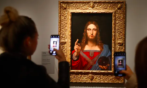
Salvator Mundi by Leonardo da Vinci posing for the camera
There’s only one Salvator Mundi, and who gets to keep him? Isn’t art meant to be for everyone (I’m gently introducing my utopian hopes)? I wouldn’t want to return da Vinci’s painting to the gods, but I’d like to return parts of the art market, art’s inane prices, and investors’ savage purchasing and ownership of art. They ain’t collectors – they’re investors.
There’s a sharp shift occurring, and to repeat Levy’s words – buying art doesn’t feel like it’s done out of love for the object, but for making money. NFTs make it super easy to sell and resell artwork in a blink, its value ballooning out of control. You can use cryptocurrency to pay for it – facilitating a quicker exchange of capital, and quicker market turnover.
I’m not lamenting analog days bygone where you carried crumpled cash in your pocket to pay for your embodied thing from a guy behind the counter – I am lamenting a fading relationship with art. I trust that anybody that loves art has felt similarly to what I am presently feeling. I trust that anybody that loves the money (and cultural/economic capital) art can bring is excited about these new frontiers.
Something here feels at odds. The art market has forgotten art – it sells stocks, stocks which are now as abstract and volatile as Wall Street’s stocks ‘cause you can’t even touch them the way you could touch your Goya (lucky you if you got one at home).

Just a little treat by fun-loving Francisco Goya - Cannibals Gazing at Their Victims, c. 1800. Love you G <3
When was the last time you looked at an art work, and felt something? When was the last time you looked at an artwork, felt something, sat with that feeling, and thought about it for a while? Can you put your phone down and look at the thing and see what it tells you, rather than take a picture of it for your followers to view indifferently, as you are the artwork before your eyes?
The gods must be crazy – I’d like, like Xi, to walk to the edge of the earth and throw NFTs away in hopes that we focus on our relationship to art, rather than the $$$ it can swell our bottomless bellies with.

Bye hype I don’t need you no more, take your money with you. Still from The Gods Must Be Crazy.
Dec. 20, 2020
Jeff Koons and MasterClass are the same thing actually
Jeff Koons is now offering classes on “art and creativity” on MasterClass, and that’s great. It’s the perfect coupling between an entertainment platform that doubles as educational, and another entertainment platform that doubles as an artist.

Jeff Koons teaches Art and Creativity, a MasterClass ad

Jeff Koons in front of his artwork
Let’s play a game of logic. If MasterClass is entertainment led by celebrities, and Koons’s totality is entertainment led by a celebrity, then the result is a faultless union, or some meta form of mirroring. Maybe MasterClass and Koons are one in the same? This duality might elevate his MasterClass series to the status of artwork by osmosis. Let’s not do that because his lectures could be art as much as MasterClass could be a trade college.
Both platforms work similarly:
1. They take your money for a glossy product
2. They don’t consistently deliver what they promise (to educate and “to art”)
3. They entertain you
4. They sell celebrity
MasterClass’s offer of educational seminars led by experts in their fields – okay, celebrities – on varied flashy topics is seductive. There’s a selection of lectures on cooking and writing, film directing and acting, sports, business, and photography.

Martin Scorsese teaches Filmmaking, a MasterClass ad

Usher teaches the Art of Performance, MasterClass ad
Lecturers like Margaret Atwood, Natalie Portman, Usher, Martin Scorsese and Jane Goodall have earned their stars IRL and what their work for MasterClass provides, overall, is binge-worthy entertainment which some students have reviewed as “could have been a TED talk”. The videos are flawless, and they oftentimes give little more than broad information that serves more as inspiration for greatness rather than a how-to. This is where we can draw a solid line between entertainment and education. Sure, you may take something away from the videos, but that likely won’t be how to become Annie Leibovitz. Speaking of her part in the MasterClass series, one student said that it felt more like an evening with Leibovitz rather than a class. I got this product review information online, in case you wonder.

Quote from Annie Leibovitz from her MasterClass
So, if you want to gain vocational inspiration from celebrities, MasterClass is great. Celebrities are a glossy, coveted bunch. We love them and always want of piece of them – a piece of their lives, glamour, success, even an object that they touched. Remember Andy Warhol? He told us ALL about that! That is precisely why MasterClass is such a desirable product, and its production value is as perfected as Christina Aguilera’s makeup (who leads seminars on singing). Jeff on the other hand…

MasterClass ad
What a great addition to the roster! A match made in heaven. Jeff Koons is controversial, and people still don’t know how to feel about him. Is he just pulling our leg, is he Warhol 2.0, and is he ironizing a rotten society? Or are his hyper-inflated/hyperreal works, persona, celebrity, wealth and cold ambition actually genuine? I think the answer is the latter, and he’s appropriating Warhol’s gig to legitimize himself among art critics, gallerists, buyers, and the public. Read Jerry Saltz’s review of his retrospective at the Whitney for an eloquent review of Koons.

Jeff Koons in front of his work
So Koons built an aura – in that, he is extremely successful. I will not dive into art’s integrity, what it means to be an artist, or what is art, because that’s not the point. The point is, he is a celebrity because of the aura and identity he has long cultivated, and he is wildly entertaining. We love to hate him, we think about him, write about him, give him shows and public spaces to present his work, talk poorly and highly of him, and it’s precisely that ongoing entertaining controversy that has skyrocketed Koons to the celebrity stratosphere. But how, with that garish inflatable swan? Does it matter? How did the Kardashian clan make it?

Jeff Koons’s inflatable swan was shown at Art Basel Hong Kong in 2018
I really wish I could sit with Andy Warhol and talk about this. Maybe he will appear in my dreams this evening and let me know.
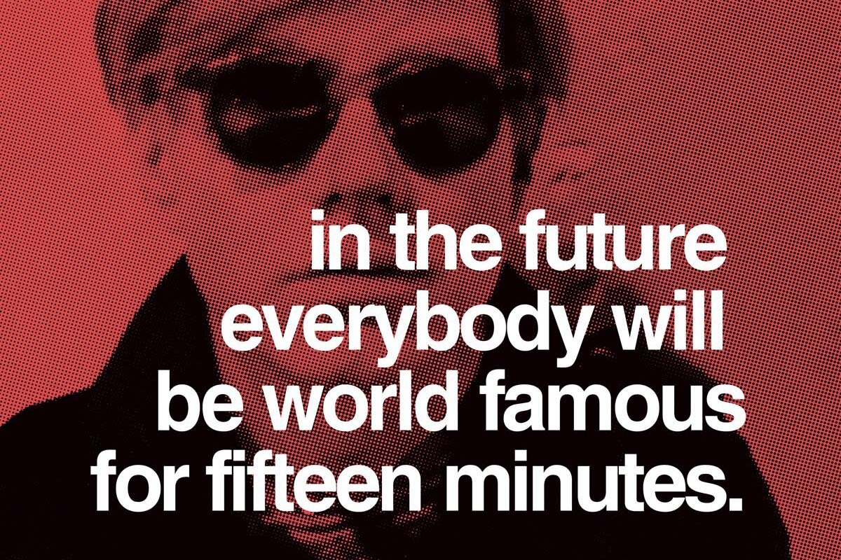
Love you Andy
Dec. 12, 2020
Celebrities that make artwork make better artwork than you
For a while now, I have been hypnotized by the artworks of celebrities who are not professional visual artists. Most of their work is truly bad. Some of it is not so bad. Some of it is hilarious. And most of my reactions to their artwork make me feel a bit guilty for judging their efforts from the high horse I pose on called art school/art criticism/art writing/art professionalism. I feel that gnawing sense because some of their works feel more genuine than a lot of what’s exhibited/bought/sold/written about in the “serious art world”. What do I mean by genuine? In part, I mean that some celebrity art is created in the spirit of the old-fashioned motto “art for art’s sake” a.k.a. the artwork was made because it had to be made—ideally, it does not consider patronage, taste, class, money, or even having to be liked by anyone. Imagine that the artwork is a singular, unique entity that must exist, and the artist is the vessel that births that entity. What happens with the art after its creation does not, and should not, matter. In a nutshell, that’s art for art’s sake. It’s a good ingredient to a genuine result.
On the other hand, I feel that because these celebrities do not possess the pomp of the hyper-inflated contemporary art world, nor its static academic subsidiary, their works are not molded after the cookie-cutter list of “hot art topics” which change slightly less frequently than the fashion industry. So, one part “art for art’s sake” and one part artworld chastity equal a genuine result. Paradoxically, being “genuine” is a hot commodity when it comes to making “good” artwork, and it’s highly valued in the artworld. I have a difficult time slotting these celebrities’ artworks in my opinion archive.
Enough with the conundrums, I want to show you my curated selection of celebrity art that I have loved and hated, sadly always judged, and everything in between.
George W. Bush
First and foremost, we’ve got George W. Bush, the 43rd President of the United States. He is a riot—just remember that prior to Donald, he was widely regarded as the most ineloquent man in power. His paintings are a glimpse into his intimate world.

Iconic portrait of Vladimir Putin by George W. Bush

Portraits of world leaders. Stephen Harper’s hair is as static in real life

My personal favourite - George W. Bush’s self-portrait in the bathroom series
Sylvester Stallone
Here’s a painting by Sylvester Stallone, a.k.a. Rocky Balboa, a.k.a. (John) Rambo. His masculine characters that kicked ass are undermined by the man behind the show—still explosive, still chaotic, still sort of cheesy.
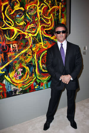
Sylvester Stallone in front of his work

Artwork by Sylvester Stallone
Adrien Brody
Adrien Brody. His series titled Hotdogs, Hamburgers, and Handguns debuted at Art Basel Miami Beach in 2015. It was a commentary on American consumerism. Unlike George W. Bush and Sylvester Stallone, Brody has his finger on the trendy topic trigger.

Adrien Brody artwork from the series Hotdogs, Hamburgers, and Handguns

Adrien Brody in front of his work, dressed as an artist
James Franco
I am not sure what to say about James Franco. He’s an inexhaustible spring of happenings.

Painting by James Franco

Ryan is Raw Power by James Franco

Triple Team by James Franco
Shia LeBeouf
Shia LeBeouf made ripples in the art world with his performance piece #IAMSORRY at the Cohen Gallery in L.A. in 2014. LaBeouf sat at a table with a paper bag over his head with the inscription “I am not famous anymore”. Volunteering participants could sit across the table, choose an item presented in front of them (some options included a ukulele, a vase of flowers, a bottle of Jack Daniels) and do as they please with it. The artwork screams of appropriation/plagiarism(?) from works made by Yoko Ono and Marina Abramovic. One of LaBeouf’s viewers sexually assaulted him.

Performance by Shia LeBeouf
Pierce Brosnan
Pierce Brosnan. Especially his portrait of Fidel Castro. His oeuvre feels like something you might purchase at a Caribbean all-inclusive resort to remember your week of sun-kissed debauchery, mixed with a nod to Henri Matisse and Fauvism. I actually like Brosnan’s sense of colour.

Painting by Pierce Brosnan
Another work by Pierce Brosnan
I can go on for ever—there are so many artist celebrities. Stay tuned for Vol. 2! P.S. if George, Sylvester, Adrien, James, Shia or Pierce happen to read this: you’re a better artist than 90% of people that work in the art world. I mean it.
Concerning freedom of speech:
In light of the artists’ protests happening in Cuba to fight for the democratic right of freedom of speech which have been met with state punishment in the form of detainment and arrests: it’s important to remember that police and state violence are not unique to authoritarian states.

Protestors in Havana, November 2020
Freedom of speech is a basic tenet of democracy, and is essential. Artists, should exercise their right to comment on and criticize their government. In democratic states, violence is realized through similar mechanisms as seen recently in Havana. Max Weber saw the modern state primarily through the prism of the violence it monopolizes in pursuit of its legal order.
The Weberian statehood principle, as seen in the application of force to secure purported order, is in conflict with the democratic principle, as seen in freedom of action and expression. Artists such as the Spanish collective DEMOCRACIA explicitly point to this paradox with their work We Protect You From Yourselves.

We Protect You From Yourselves by DEMOCRACIA
That statement, along with “It’s either us or chaos” were given by police officers partaking in the diffusion of protests in Spain. The officers’ assertion that citizens have to choose between the truncheon or chaos is a fundamentally authoritarian sentiment. It implies that police violence against demonstrators is a self-inflicted circumstance, absolving the state and its agents of responsibility.
Dec. 1, 2020
The museum that hasn’t been YET: Ars Aevi Museum of Contemporary Art, Sarajevo, Bosnia and Herzegovina
ars aevi meaning: art of the epoch
I find Ars Aevi in Sarajevo to be one of the more fascinating museums I have visited. I must have spoken about it more than 3,000 times and have had the opportunity to do so since seeing it in 2016. As every “art world participant”, whenever you go to a new city, one of the things you do is check out its museum/gallery scene (even though sometimes the idea of being inside another gallery makes you nauseous. Moving on!)
So, here we are, heading to Sarajevo’s museum of contemporary art. We come across the building depicted below. Its exterior aesthetic and middle-of-nowhere-socialist-architecture feel that it embodied reminded me of my home sweet home (Sofia, Bulgaria), thus, I didn’t expect much from the interior judging from the building’s exterior. What was that saying? Never judge a book by its cover. I beg to differ, but in this case, the saying held true.

Ars Aevi’s façade
Located in the Skenderjia Sports Centre, built in 1969, Ars Aevi’s façade and its surroundings looked cracked, rusty, old, oxidized, unattractive. Nothing demonstrates the trimmings of contemporary art institutions: no pillars, no stainless steel or glass, no grand entrance nor signage with prices and concessions, no minimalist designs or logos. No money. Zero money. The white cube antithesis. How amazing is that? I venture to assert that there’s little that’s humanizing about grandeur.
Before entering the space, a graffiti on the right hand side reads:
“If you are looking for hell, ask the artist where it is. If you can’t find the artist, then you are already in hell” - Avigdor Pawsner, 1793. Graffiti by Dean Jokanovic Toumin, 1993.

Graffiti by Dean Jankovic Toumin, 1993
That quote moves me every time I read it. So wait, what is this place? It’s not actually a typical museum - and its collection was not procured in a typical way. The space is a temporary solution, and most works have been donated by the showcased artists.
The Ars Aevi project was launched as an act of revitalization for Bosnia and Herzegovina after the war that split Yugoslavia. B&H’s experience of the war was horrific - war crimes, massacres, the ethnic cleansing of tens of thousands, countless casualties. The siege of Sarajevo (1992-1996) left the capital devastated. Many of its buildings are pock-marked with bullet holes to this day.

Sarajevo streetview
As a gesture of collective goodwill to help B&H’s cultural recovery, notable artists were asked to donate some of their works to the Ars Aevi project. Their donated works would be housed in a brand new museum whose blueprints were designed and donated by Renzo Piano (the architect responsible for the Pompidou Centre in Paris and The Shard in London). The project was led by Ars Aevi’s founder, Enver Hadžiomerspahić who has stated that the collection is primarily a “project of an ethical relationship of the artists of the world towards that magical word Sarajevo”.
The donations and collaborations with notable art institutions came forward, but the museum was never built. Lack of funds, political complications, city planning, etc. etc., contribute to the Ars Aevi’s current purgatorial state. As the artworks had to go somewhere, they were placed in the sports centre which was redesigned by the Sarajevan architect Amir Vuk to appear as an “art depot”, or, temporary storage for the collection. The centre was not intended to be a museum that would show Bill Viola works, and its capacity for museum-quality curation and installation is modest. Some artworks by the likes of Michelangelo Pistoletto and Joseph Kosuth are placed the ground, propped against walls or on the crates they arrived in. A piece of A4 paper on the floor beside an artwork signifies its creator’s name. Occasionally there is a shoe print on the label from somebody who had accidentally stepped on, and desecrated, a famous name.
By the way, here’s a brief selection of artists found presently at the Ars Aevi:
Michelangelo Pistoletto (first artist to contribute to the project)
Anish Kapoor
Joseph Kosuth
Joseph Beuys
Jannis Kounellis
Bill Viola
Marina Abramović
Daniel Buren
Ilia Kabakov
Juan Muñoz
Nan Goldin
Komar and Melamid
Not bad, huh?

Joseph Beuys inside the Ars Aevi
Depicted above is a work by Beuys, placed on crates, leaning against plywood. I loved seeing big names presented in this context. In fact, there are many things I commend the Ars Aevi for:
Hadžiomerspahić vision: art should be for everyone, not only for the wealthy institutions/countries that can afford it; its dissemination should be ethical.
Artists’ collaborative effort, goodwill, and donations towards Sarajevo’s recovery. It’s a gesture of kindness that brings hope (we need more of that stuff).
Speaking of hope: Ars Aevi’s ongoing vision for a greater tomorrow for itself, for Sarajevo, and for Sarajevo’s people.
Ars Aevi’s current shabby state acts as an equalizer - the artwork is not treated like a relic with a high price tag. It’s accessible. The artists feel accessible, and maybe actually human.
Affordable admissions despite the collection’s financial difficulties.
A project that is so strong and unique is located in the Balkans (my heart swells with pride), in an unlikely place considering B&H’s recent traumatic history. Again, we come back to hope.
Here’s my hope - that the reasons for why I tip my hat to the Ars Aevi project stay alive. I hope that the museum finds a solution that supports its ongoing mission - whether that would be the realization of Piano’s building, or perhaps the continued poeticism of its limbo. Either way, its inception and evolution makes the Ars Aevi one of the most extraordinary projects I have encountered.
I am afraid that if the Ars Aevi collection is moved to a conventional museum space, the extraordinary way in which artists are shown will be lost. When the donated works reunite with the white cube walls and roped off floor sections, they will also reunite with their status quo of importance, opulence and sacrosanctity. For me, that could contradict what makes the Ars Aevi fundamentally different from other contemporary collections. Presently, the Ars Aevi is accessible, it’s a project of passion, goodwill and endurance, it’s humanized, unglorified, and contextually relevant.

Inside the Ars Aevi
In the summer of 2013, my colleagues and I launched a digital art criticism journal. Its name is KAPSULA - slavic for “capsule”. We have published an average of 12 issues/year. Our labor of love project carries on and thrives without any funding or sponsorship. We dedicate ourselves to KAPSULA because we want to produce culture, generate conversation, subvert institutionalized art writing, and give a new platform to young and established art writers. Our digital aesthetic adopts an analog feel - it combines agitprop and traditional newspaper qualities. Currently, we are discussing the magazine’s resurrection/reincarnation.
Visit https://kapsula.ca to see our archive, and to familiarize yourself with KAPSULA. The art community’s input will be valued. We continue striving to create a space that is engaging, evaluative and subversive.
Interesting tweets about class and social privilege in academia
Posted by political scientist and lecturer at the University of Edinburgh, Karlo Basta: https://twitter.com/KarloBasta1/status/1285559168062164995
Coming from a family with higher education contributes to your confidence and success in your academic pursuits. When I studied in university, I hadn’t a clue that I could argue grades, assignments and ideas. My parents and I are immigrants. I wasn’t confident with my English, let alone with my ideas — being thankful to have the opportunity to study in university was good enough, and the best course of action was keeping a low profile.
Eating art
Art is easily spotted – it’s the kind that is made, and lives, outside the delineations of the systems that define it in order to sell it. In these systems, everything is measured. For example – profit is measured. Hunger is measured. The utility of an item is measured. Time is measured. Art is measured. Imposing these systems helps us to define art for ourselves, it helps us define our relationship with it, measure it, and evaluate it – box it in, and then consume it.